A simple breakdown of the design steps used in defining a web site is shown below. For any new website there is a need to gain a full ‘picture’ of the ‘Information Design’ requirements of the project. By working with the client a web developer can discover the requirements of the site in terms of ‘overall purpose’, content and desired visual features. The ‘Site Design’ and ‘Page Design steps’ will naturally follow on from this requirements capturing activity.
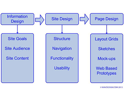
Generic Site Definition Phases
The typical website Definition phases are shown within this simple block diagram.
Responsive Website Design (RWD)
Responsive web design (RWD) is a web design and development methodology aimed at building entire web-sites or single web-pages which provide an optimal and consistent viewing experience, across a wide range of devices (from desktop computer & Laptop monitors to Mobile Phone and Tablet screens). It is an approach aimed at crafting sites to provide an optimal viewing experience, easy reading and a navigation system which requires only a minimum of resizing, panning, and scrolling, across a wide range of devices (from mobile phone screens to desktop computer monitors).
A site designed with RWD adapts the layout to the viewing environment by using fluid, proportion-based grids, flexible images, and CSS3 media queries. Media queries allow the page to use different CSS style rules based on characteristics of the device the site is being displayed on, most commonly this will be the width of the browser. Server-side components are also used in conjunction with client side ‘media queries’ to produce faster-loading sites for access over mobile networks. This type of site will invariably have much improved functionality/usability and response time.
Typical recommended screen resolution for different devices are a good starting point for beginning a responsive website design:
- Desktops, PCs and tablets
- 800 х 600
- 1024 x 768 (iPad)
- 1280 х 1024
- 1600 х 900
- Mobile devices
- 640 х 480 | 480 х 320 (iPhone)
- 320 х 40 (other smartphones)
From this list we might choose the large desktop, iPad and iPhone dimensions as our default sizes. These three dimensions will then be used as the width of the three content mock-ups. Each mock-up will show how the content should be placed depending on resolutions of the different devices. The largest resolution (generally the PC screen/viewport) will be the starting point in any design. Of course at this stage the layouts will be sketched on paper and further mocked up into layer comps in Photoshop (perhaps) before any coding begins.
For More information on Responsive Website design please see this overview article: A List Apart – Responsive Web Design
Alternatively this is a good primer on the subject: Creative bloq – Get Started With RWD
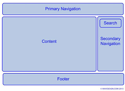
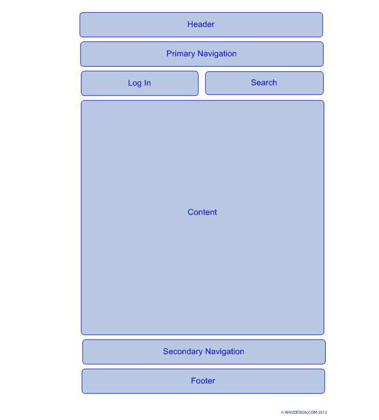
A Typical Web Site Design Layout for viewing on PC or Laptop
The typical elements of a web site design layout are shown below. This format is specifically aimed at PC or Laptop access.
A Typical Web Site Design Layout for viewing on Mobile devices
The typical elements of a web site design layout built for Mobile devices (in this case a phone) are shown below.
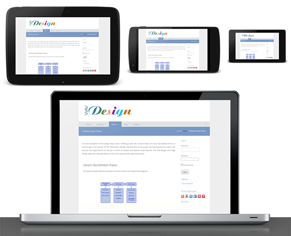
Final Execution of the site, showing how layout differs in different user agents.
When viewing the finished website via different browsers (or user agents) then the relevant layout is loaded automatically based on the screen sized used. This is Responsive Web Design in operation.